Where Is the Most Dangerous Drinking Water?

 What could be simpler than drinking a glass of water? 

In the UK, when you turn on the tap, you assume what comes out will be drinkable. Indeed, the UN General Assembly recognises access to safe drinking water as a human right. And yet, more than a quarter of the world's population lives in water-stressed countries, and a similar number use a drinking water source contaminated with faeces, according to the World Health Organization. 

Unfortunately, national wealth can be a deciding factor in whether a person can pour a safe glass of water to drink. According to the Environmental Performance Index (EPI), "good [environmental health] policy results are associated with wealth (GDP per capita), meaning that economic prosperity makes it possible for nations to invest in policies and programs that lead to desirable outcomes." To make matters worse, the heavy industry poorer countries employ in the attempt to level up can further compromise the local water. 

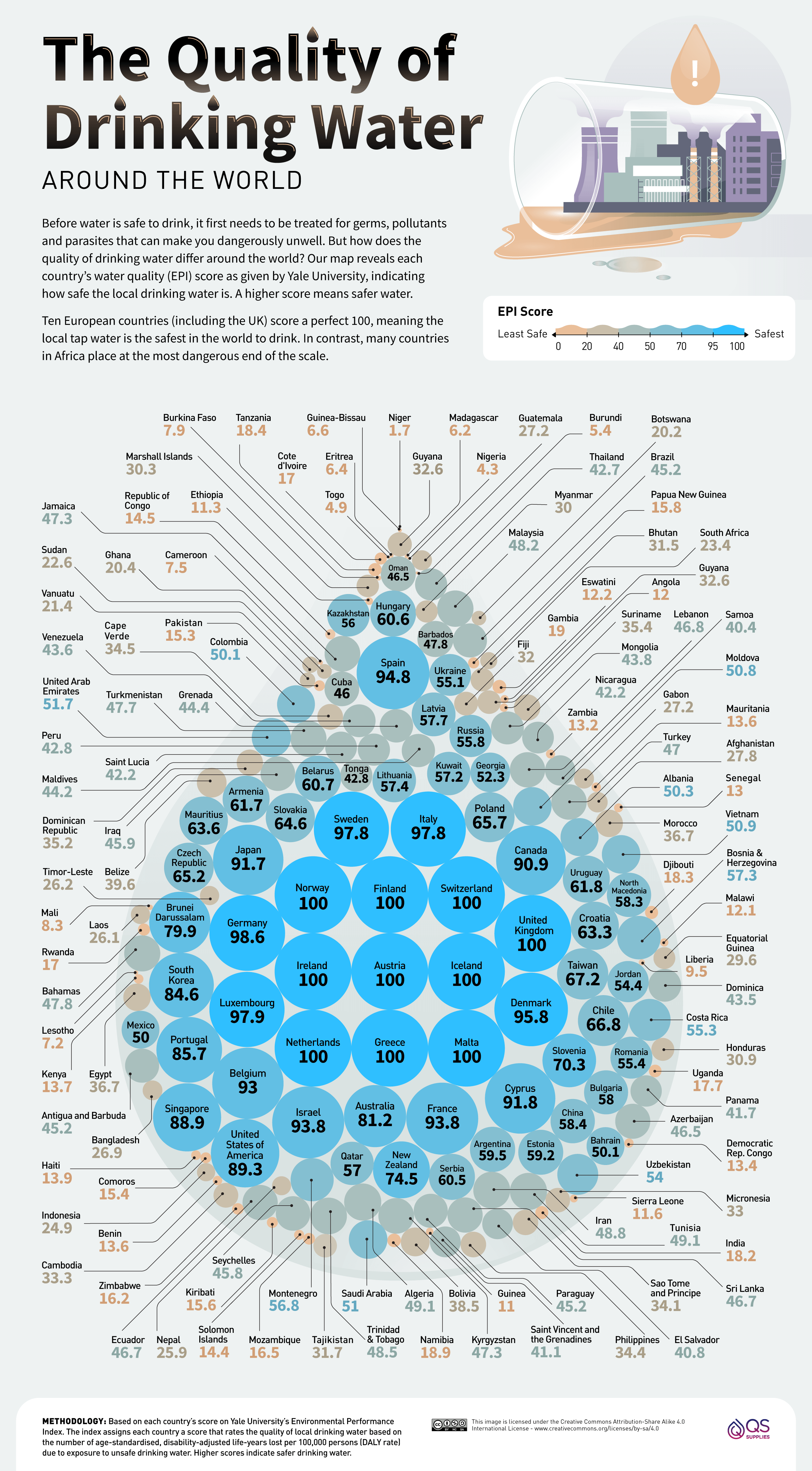
The EPI index is designed to rate and monitor water quality around the world. Experts assign each country a water quality score based on the number of (adjusted) life years lost per 100,000 persons (DALY rate) due to exposure to unsafe drinking water. This number itself is based on the IHME's Global Burden of Disease study. 

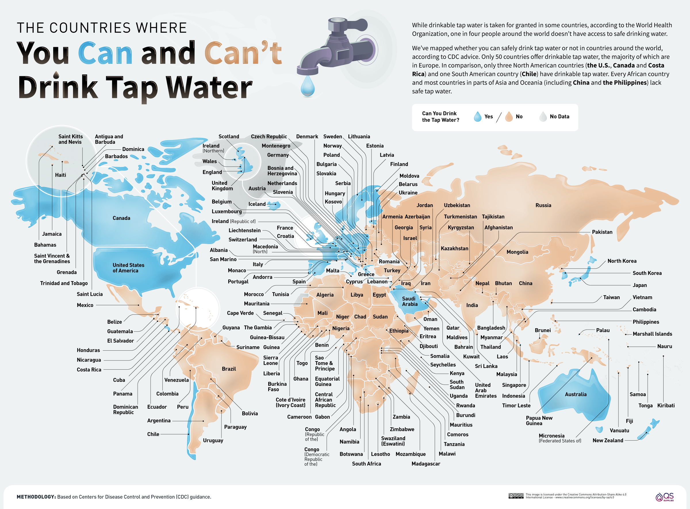
To illustrate the starkness of the situation and to flag the countries where it is and isn't safe to drink the tap water, QS Supplies has used EPI and CDC data to create a set of new data visualisations.

Where Is the Most Dangerous Drinking Water?

Where Is the Most Dangerous Drinking Water Mapped

Key Findings 

● Ten countries have the maximum 100 EPI score for water, and they're all in Europe.
● However, the European countries of Albania (50.3) and Moldova (50.8) achieve barely half of this.
● The 24 countries with the lowest EPI rating are all in Africa, and the CDC warns against drinking tap water anywhere in Africa.
● The CDC discourages drinking tap water in much of Asia and Latin America.
This post may contain affiliate links. As an Amazon Associate, I earn from qualifying purchases.


Comments

Popular posts from this blog

Find cities with similar climate

This map has been created using The Global environmental stratification. The Global environmental stratification (GEnS), based on statistical clustering of bioclimate data (WorldClim). GEnS, consists of 125 strata, which have been aggregated into 18 global environmental zones (labeled A to R) based on the dendrogram. Interactive map >> Via www.vividmaps.com Related posts: -  Find cities with similar climate 2050 -  How global warming will impact 6000+ cities around the world?

Moose population in North America

The moose population in North America is shrinking swiftly. This decrease has been correlated to the opening of roadways and landscapes into this animal's north range.   In North America, the moose range includes almost all of Canada and Alaska, the northern part of New England and New York, the upper Rocky Mountains, northern Minnesota and Wisconsin, Michigan's Upper Peninsula, and Isle Royale.    In 2014-2015, the North American moose population was measured at around one million animals. The most abundant moose population (about 700,000) lives in Canada. About 300 000 moose remains in nineteen U.S. states Alaska, Colorado, Connecticut, Idaho, Maine, Massachusetts, Minnesota, Montana, Michigan, Nevada, New Hampshire, New York, North Dakota, Oregon, Utah, Vermont, Washington, Wisconsin, and Wyoming. The largest moose specimens are found in Alaska 200 thousand moose. Below the map shows the size of US states scaled by the moose population.     Via www.vividmaps.com

Human Emotions Visualized

Despite significant diversity in the culture around the globe, humanity's DNA is 99.9 percent alike. There are some characteristics more primary and typical to the human experience than our emotions. Of course, the large spectrum of emotions we can feel can be challenging to verbalize. That's where this splendid visualization by the Junto Institute comes in. This visualization is the newest in an ongoing attempt to categorize the full range of emotions logically. Our knowledge has come a long route since William James suggested 4 primary emotions: fear, grief, love, and rage. These kernel emotions yet form much of the basis for current frameworks. The Junto Institute's visualization above classifies 6 basic emotions: fear, anger, sadness, surprise, joy, love More nuanced descriptions begin from these 6 primary emotions, such as jealousy as a subset of anger and awe-struck as a subset of surprise. As a result, there are 102 second-and third-order emotions placed on this emo