Change in CO2 emissions per capita (1990 - 2016)

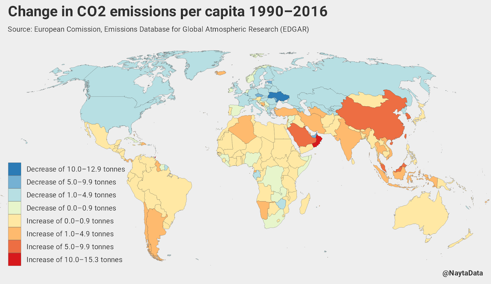
The map below visualizes the change in per-capita Carbon dioxide emissions in every country from 1990 to 2016.

Change in CO2 emissions per capita (1990 - 2016)
Reddit user: NaytaData

The countries that have seen the biggest decreases in CO2 emissions per capita are Luxembourg, Ukraine, and Bahrain.

Countries like Oman and China stand out as countries that have had their carbon dioxide emissions increase drastically these past decades.
This post may contain affiliate links. As an Amazon Associate, I earn from qualifying purchases.


Popular posts from this blog

Find cities with similar climate

This map has been created using The Global environmental stratification. The Global environmental stratification (GEnS), based on statistical clustering of bioclimate data (WorldClim). GEnS, consists of 125 strata, which have been aggregated into 18 global environmental zones (labeled A to R) based on the dendrogram. Interactive map >> Via www.vividmaps.com Related posts: -  Find cities with similar climate 2050 -  How global warming will impact 6000+ cities around the world?

Moose population in North America

The moose population in North America is shrinking swiftly. This decrease has been correlated to the opening of roadways and landscapes into this animal's north range.   In North America, the moose range includes almost all of Canada and Alaska, the northern part of New England and New York, the upper Rocky Mountains, northern Minnesota and Wisconsin, Michigan's Upper Peninsula, and Isle Royale.    In 2014-2015, the North American moose population was measured at around one million animals. The most abundant moose population (about 700,000) lives in Canada. About 300 000 moose remains in nineteen U.S. states Alaska, Colorado, Connecticut, Idaho, Maine, Massachusetts, Minnesota, Montana, Michigan, Nevada, New Hampshire, New York, North Dakota, Oregon, Utah, Vermont, Washington, Wisconsin, and Wyoming. The largest moose specimens are found in Alaska 200 thousand moose. Below the map shows the size of US states scaled by the moose population.     Via www.vividmaps.com

Human Emotions Visualized

Despite significant diversity in the culture around the globe, humanity's DNA is 99.9 percent alike. There are some characteristics more primary and typical to the human experience than our emotions. Of course, the large spectrum of emotions we can feel can be challenging to verbalize. That's where this splendid visualization by the Junto Institute comes in. This visualization is the newest in an ongoing attempt to categorize the full range of emotions logically. Our knowledge has come a long route since William James suggested 4 primary emotions: fear, grief, love, and rage. These kernel emotions yet form much of the basis for current frameworks. The Junto Institute's visualization above classifies 6 basic emotions: fear, anger, sadness, surprise, joy, love More nuanced descriptions begin from these 6 primary emotions, such as jealousy as a subset of anger and awe-struck as a subset of surprise. As a result, there are 102 second-and third-order emotions placed on this emo