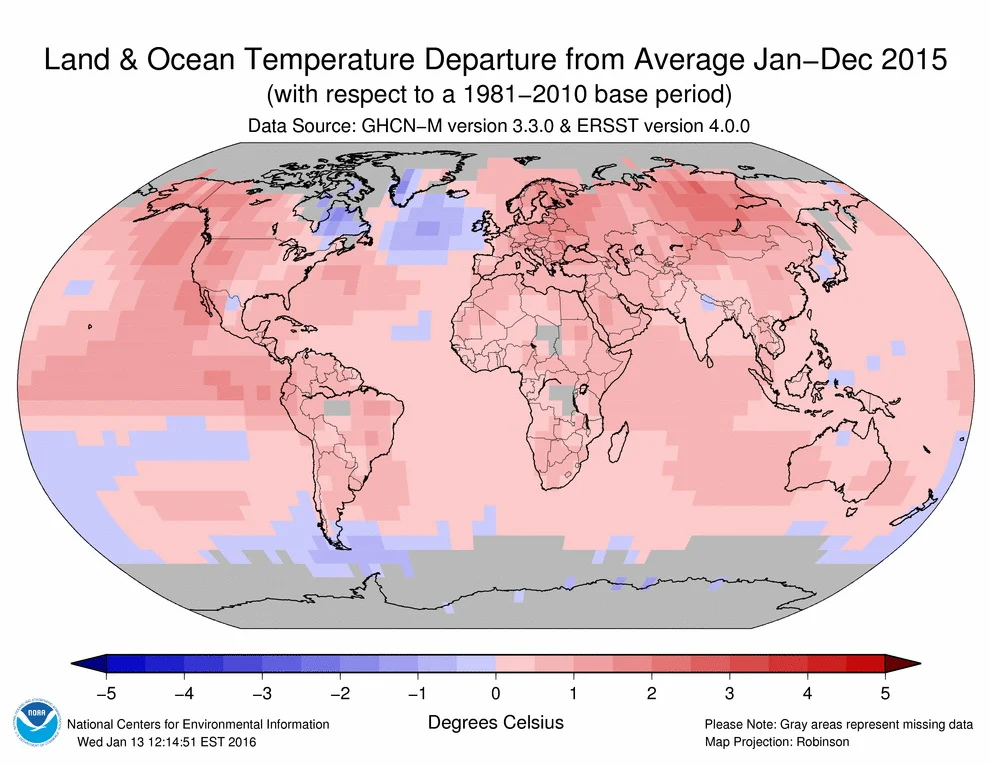
2015 was hottest year in recorded history.
This visualization illustrates Earth’s long-term warming trend, showing temperature changes from 1880 to 2015 as a rolling five-year average. Orange colors represent temperatures that are warmer than the 1951-80 baseline average, and blues represent temperatures cooler than the baseline.
This visualization illustrates Earth’s long-term warming trend, showing temperature changes from 1880 to 2015 as a rolling five-year average. Orange colors represent temperatures that are warmer than the 1951-80 baseline average, and blues represent temperatures cooler than the baseline.

This post may contain affiliate links. As an Amazon Associate, I earn from qualifying purchases.
Comments
Post a Comment